Description:
New brand for colleague designer.
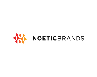
The goal was to represent designing process.
Arrows streaming from different directions - just like workflow and communication between designer and his client during the design process. Arrows create double N - (Noetic) , and they're double because brands are plural.
UPDATE! white bckgrnd
As seen on:
http://logopond.com/members/profile/showcase/32611
Status:
Client work
Viewed:
4653
Share:
Lets Discuss
Nice mark
Replythanks bitencourt
ReplySuperb Mark! I love it!
ReplyI'm glad you do oski. Thanks.
ReplyNice work.
Reply%3C----Thats right... Its a very nice mark. :)
ReplyFantastic use of negative space and geometric shapes.
ReplyThanks lumo, ben, ocularink and once again thanks riz!
ReplyThanks lefty.*And thanks for the floats all.
ReplyVery nice, buddy
ReplyNice call with having two N's.
ReplyThanks ezemiac and mfrank.
ReplyAndrej, you might wanna post one on white BG..just to see which one people like the most. Just a thought %3B)
ReplyBoth look nice, but to me, the negative space pops a little more against the black background. This is all subjective though.
Reply%5Eagree with ocularink but here it is updated for trying sake
ReplyI think both are great.. the negative space pops on dark BG coz of the marks color. I'm doing my website right now and am still undecided on the BG lol... Good work Andrej!
ReplyThanks Riz, much appreciated!
ReplyThe symbol looks great! :)
Replytass, thank you.
ReplyReally good stuff Andrej. *@Noetic Brands*Good pick:)
Replythanks roko
ReplyCheers Roko.
ReplyVery very cool.
ReplyAmazing solution!
ReplyI am glad you think so Muhammad. it was my pleasure to work for mr.Ali.
ReplyMy pleasure! At first glance i thought you were talking about my me coz im Ali also %3B)
ReplyLOL! I guess its a frequent name then. Cheers!
ReplyPlease login/signup to make a comment, registration is easy