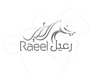
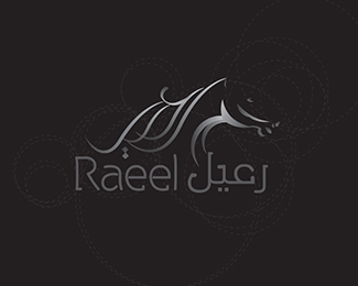
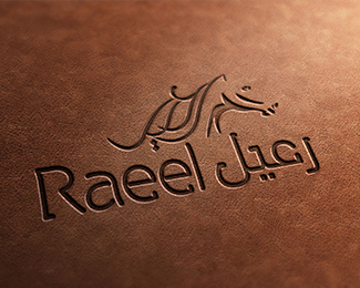
Raeel
by hotrun • Uploaded: Mar. 19 '13

Float
(Floaters:
1 )
Description:
holding company in KSA
Status:
Client work
Viewed:
1877
Tags:
Logo
Share:


Lets Discuss
I really like it how this logo looks when stamped into the leather.
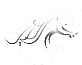
ReplyThere's been a lot of discussion about guides recently and whilst I have no issue with using this technique (not sure why anyone would), I am struggling to see how these guides have aided in the construction of the mark. I can't seem to find one guide that correlates to any of the curves of this mark. Am I missing something here?
ReplyFor the record, I do dig the mark though. Just curious.
Replyyeah i agree with matt here. i really like the mark and while i have no problem with the use of guidelines, this seems a bit arbitrary and without reason. nothing (that i can tell) is moving in the same motion as any of those curves. i see you are somewhat new on the pond, so i'll forewarn you...guidelines aren't popular over here.
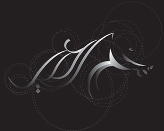
ReplyI am a little confused. I can understand showing the guide lines in one variation, but almost all? Or at least all but the ones that are supposed to look actual? The effect is distracting and detracting from the beauty of the mark. And, in all honesty, some of the guides look... off.
ReplyThank you all
ReplyBut I have to clarify
I agree with you about
But you've made ȀBȀBto add some kind of non-boring movement on the design and I have used in identity well and impressed the client much this movement
Please login/signup to make a comment, registration is easy