hollow men
by hh • Uploaded: Oct. 24 '08 - Gallerized: Oct. '08

Float
(Floaters:
43 )
Description:
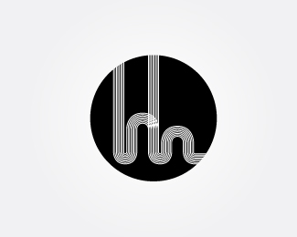
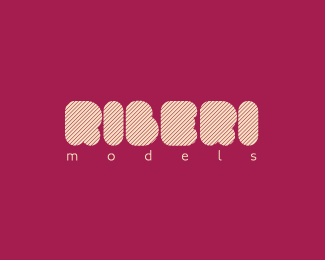
logo design for a mystery shoppin agency
Status:
Nothing set
Viewed:
18989
Share:

Lets Discuss
Mystery shopping agency?
ReplyThanks Relevant! It's 5AM here so... ZZZzzzzzz.... %3B)
Reply5am? Alen go to sleep!
ReplyLOL... I have this client from India on the other line so, gotta stay up my man! Thanks!
Replycool. nice twist at the eye %3B) really looks like a face. gr8 job.
ReplyI like it, not sure about the lines in the type
ReplyVery cool indeed, bubt I agree with Alex. I'd make the type solid.
ReplyWhile this is very nice visually I see the female characteristics of the symbol conflicting with the hollow %22men%22 part.
ReplyVery nice mark
ReplyGreat Mark
ReplyGreat mark! I can see Art Machine's point. %3B-)
Replygreat mark, but kind of spooky. It reminds me of the intro to %22House%22.
Replythats well nice!
ReplyNice work and color of the logo too, but my personal opinion is that the name of the logo is Hollow man but the feeling of the face is showing as a woman face. Over all work is good and creative.
Replylove the mark
ReplyBeautiful.
ReplyPlease login/signup to make a comment, registration is easy