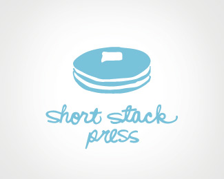
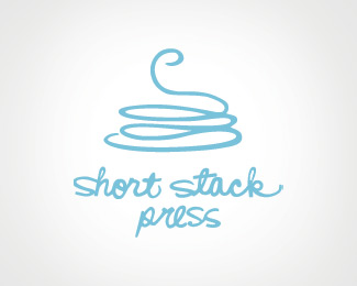
Short Stack Press
by henrya • Uploaded: Sep. 08 '09

Float
(Floaters:
7 )
Description:
Logo for letterpress studio. Inspired by a "short stack" of pancakes.
Status:
Client work
Viewed:
1360
Share:

Lets Discuss
I really like the way you represented the pancakes, I take the other logo is an abstract for of this?
ReplyI like this version the best.
ReplyLooks tasty! Melted butter always gets my vote! %3B)
Replyi like this one with the butter running off better than the other!
ReplyPlease login/signup to make a comment, registration is easy