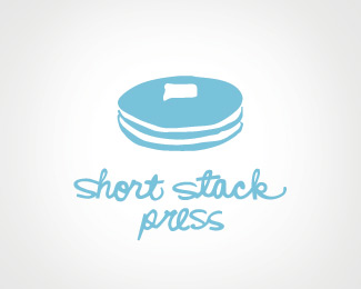
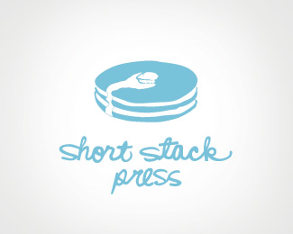
Short Stack Press
by henrya • Uploaded: Sep. 08 '09

Float
(Floaters:
5 )
Description:
Logo for letterpress studio. Inspired by a "short stack" of pancakes.
Status:
Client work
Viewed:
949
Share:

Lets Discuss
Nice design.
ReplyThanks - I'm really curious as to what everyone thinks. Would love some good honest critique.
ReplyThis is my favorite of all your concepts for this. So many times the mark and text are unrelated. This is almost perfect.
ReplyI like very much that the typography is custom to the point that even the same letters throughout are unique. I prefer this design over the others by far. The others are too on the nose. This is more subtle. You wouldn't know it's a short stack unless with the name. That's good.
ReplyPlease login/signup to make a comment, registration is easy