
Description:
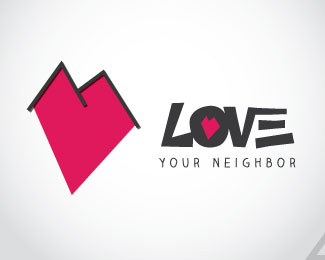
This was a logo mark that was created for a church that was doing a campaign called "Love Your Neighbor." I believe that his was a strong concept. The simply made a more geometric heart rather than the typical rounded heart. After that I played around with putting a door, windows and such but realized that all it needed to set the context was to give it a roof. I wold be interested in hearing your feedback on this mark.
Status:
Client work
Viewed:
1764
Share:


Lets Discuss
looks more like love for mountains..
ReplyPlease login/signup to make a comment, registration is easy