HomeWork Architecture
by hardlysquare • Uploaded: Jun. 28 '08

Float
(Floaters:
4 )
Description:
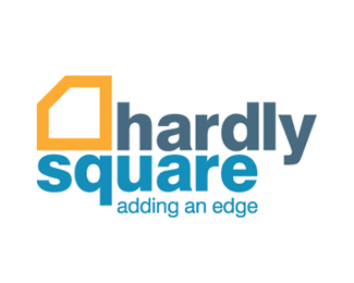
HomeWork an architecture/remodeling company wanted a witty logo that had a sense of high-end design.
Status:
Nothing set
Viewed:
1967
Share:


Lets Discuss
Thanks nima.jazireh! I'm glad you like it. You have some very good logo designs yourself.
ReplyClever.
ReplyThanks SpiffyJ! I was pretty happy with the outcome of this idea. You wouldn't believe how many roughs I made before discovering this solution. The client loves it.
ReplyVery elegant, %22hardly%22. Clever use of an enlcosure too!
ReplyThanks Sailendra! I appreciate the good words. Funny you should say elegant too. That was one of the key adjectives the client wanted to transmit.
ReplyVery clever. The only problem you might have is, the 'H' doesn't come across very quickly. I see the 'W' first. But the way you managed the 'H', 'W', and 'A' in the mark is very clever.
ReplyOcularlnk,*I agree. I see the 'W' first as well. Fortunately the client didn't and loves their new logo. Not that that's the end-all cause I always design my logos to their greatest potential no matter what. I couldn't come up with a solution that matched the cleverness of this one and have the 'H' come across 1st.
ReplyPlease login/signup to make a comment, registration is easy