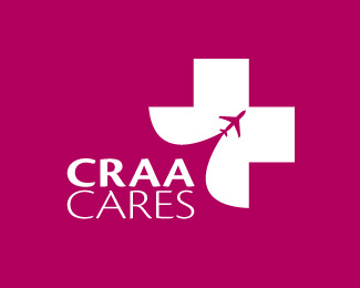
CRAA Cares #2
by gyui • Uploaded: Nov. 12 '08

Float
(Floaters:
13 )
Description:
CRAA is the Columbus International Airport, and this would represent their community service branch. WIP.
Status:
Nothing set
Viewed:
4587
Share:


Lets Discuss
Great idea with a bad font. Try to make the symbol a little smaller.
ReplyI think your right about the mark being too big. In terms of the font, I'll play around with it. Thanks errede:)
ReplyDoes anyone else see a phallic symbol?
ReplyWell, planes in themselves are phallic. I think it's a cool mark. Just needs to be sized down and have a better font.
Reply@ insomnisdesign: yeah, i unfortunately can't change the shape of a plane, so i can't really do anything about the phallic nature of it:P**@lawrence anderson: when i get a chance, i'll size the mark down and look at other font options.**Thanks guys for your thoughts!:)
ReplyJust updated it, feedback would be great!
Reply@smartinup: yeah, after looking at it for so long, i saw angel wings, which is still ok with me considering it's for a charity/community service branch. %0D*%0D*Don't know how I'd relate a jellyfish towards charity though ...mmmm:P%0D*%0D*would it make more sense if there were wrists?
ReplyThis is much better now, but I would loose the yellow background here...
ReplyI guess you're returning the favor, huh Type08?:P
ReplyI saw 2 birds and plane %3B)
Replyhuh ... now that I look at it, i see 2 birds too :P
Replythanks Houston-we, much appreciated!:)
ReplyEven if people are seeing birds, wings and angels - they are all things associated with flight and all positive icons, you are getting the essence of the mark across.*I got the hands surrounding the plane concept right away - it drew me in for a closer look. I like it.
ReplyThanks thisGuy and muse7, glad you interpreted the mark as it was intended! :)
ReplyVery cool, I like it!
ReplyIt gives a new perspective to the 'human touch' expression, very nice!
ReplySecond thought, is it good that the hands point down?
ReplyPlease login/signup to make a comment, registration is easy