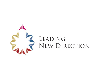
Leading New Direction update
by gyui • Uploaded: Nov. 11 '08

Float
(Floaters:
5 )
Description:
Airport trying to refocus all levels towards 1 direction. WIP concept #2
Status:
Nothing set
Viewed:
2986
Share:


Lets Discuss
a lot of levels. it looks like a whale, a torpedo, a penis and a sales chart with wings. guess it could work.
ReplyYeah, this company manages 3 airports, and each airport has departments like police, fire department, HR, etc, so it is suppose to show multiple areas that eventually come together towards 1 goal in the shape of a plane.**i thought it was pretty obvious as a plane. Yeah, I'm definitely not trying to display a penis, but it's interesting what people see.:) thanks for the input THEArtistT
ReplyVery nice execution on this. The concept is quite interesting. Nice work.
Replyappreciate the comment and float tass :)
ReplyWith the recent plane crashes...showing one that seems to be on fire is not a good move IMHO
Replyactually Brandsimplicity, if you look at the submission date, it was last nov. '08. I can't recall any major crashes during that time. and it is actually pink (their color) directional arrows pointed upward that created the plane.
ReplyI really enjoy the cleanliness of this logo. The mark is beautiful, seems strong but still elegant...the variation/gradient of the many arrows give it a nice illusion of wind over the wings or movement to its goal.
ReplyPlease login/signup to make a comment, registration is easy