Description:
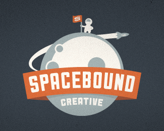
Working on a re-branding for a Canadian Design agency called ONST Creative.
The concept for the logo are robots (YAY!) and this is one of the concepts that got scrapped.
Originally posted on Dribbble: http://drbl.in/cYsG
Status:
Unused proposal
Viewed:
17449
Share:


Lets Discuss
maaan .... that's really awesome !!
ReplyWhat a cool logo!
ReplyB A M ! Love it, Emir.
ReplyUh ti! Interesting style)
ReplyNICE COLOURS TOO
Replyvery retro :D love it!
ReplyBlam!!! Soooo sick!
ReplyGreat !! )
ReplyLooks like a classic!
ReplyNice one Emir.
Replylike a boss :D !
ReplyLike the Post Retro Style - You must be a big Charles S. Anderson fan.
Replyfree the robots!
ReplySo good !
ReplyYes, this is great man!
ReplyThis is so whimsica. Love te type, colors, and of course the cool robot.
ReplyThank you all for the very kind words. I'm humbled.**Client eventually ended up picking this version.
Replyloveee itt!
ReplyGreat logo! Looks like Bender a little bit )) Love his shiny metal ass )
ReplyReally Good Retro Style!
Replygood stuff!
ReplyPlease login/signup to make a comment, registration is easy