Help for Keyo
by grahammond • Uploaded: May. 30 '09

Float
(Floaters:
0 )
Description:
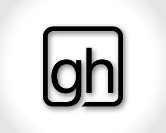
This is a slight modification I did to one of Keyo's personal logos to show him some tweaks he should look at.
Status:
Just for fun
Viewed:
1820
Share:
.png)


Lets Discuss
For posterity: Kevin's %3Ca href%3D%22http://logopond.com/gallery/detail/64611%22%3EPersonal Logo%3C/a%3E to which I am referring.
ReplyActually Kevin, I altered your current one using guides to make sure everything lined up%3B but I would recommend restarting it using a grid so it's spatially perfect all around.**I assume you're using Illustrator. What you'll want to do is go into the %3Ci%3EView%3C/i%3E menu, and select two options at the bottom%3B turn on %3Ci%3EShow Grid%3C/i%3E and %3Ci%3ESnap to Grid%3C/i%3E. It's basically like connect the dots at this point. You'll have to mess around a bit until it's comfortable for you, then find a measurement that works with your logo and keep it constant all the way around. **For tips and help like this, I was referred to %3Ca href%3D%22http://typophile.com%22%3ETypophile%3C/a%3E by %3Ca href%3D%22http://logopond.com/members/profile/showcase/21000%22%3ELefty%3C/a%3E. You should join, the community over there is much more helpful with things like this than Logopond. I have been seeking constructive help here like I provided you, and I haven't really found it. Seems like that's what they're all about over there though.
ReplyPlease login/signup to make a comment, registration is easy