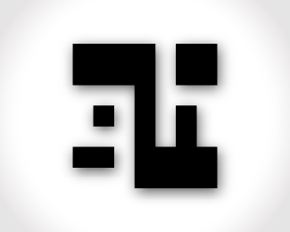
GH - gear shift
by grahammond • Uploaded: May. 09 '09

Float
(Floaters:
2 )
Description:
More progress with my never ending personal brand identity project. Again trying to work with a simple shape to convey my initials. This one began to look like a gear shift diagram on top of most manual shift knobs. I've become kind of partial to it, as I am a big car buff.
Status:
Nothing set
Viewed:
9599
Share:
.png)

Lets Discuss
Looks like a copy of the LG logo
ReplyGraham, I like this one the best. I don't think it is too similar to the LG logo. Similar in style, but the concept and execution are different enough to stand apart. I also got the gear shift feeling at first glance. I too am a car buff. %3B-)
ReplyLG..
ReplyThanks for your input Kevin. I am looking for helpful info here and it seems somewhat hard for a new guy to come by. **I hadn't thought of the LG logo at all until I got the comment 10 days back, and then I had to look it up to see. I don't think it looks like the LG logo much at all, maybe if I had terminated the G at 12 o'clock then it would be close. But even still, the LG logo is intended to make a face and mine is nothing close to that. I have updated it to have just the mark in black rather than reversed out on a circle, maybe people will see less similarity with the LG logo this way.**Also, I realize that presenting a black logo on a white background comes across as boring. I thought the emphasis was supposed to be on the logo, but I've seen that people are presenting their logos with gradients/decorated backgrounds and for some reason it gives more life to the logo... so I have done the same hoping that my logos look a bit less lifeless.
ReplyAdding a shadow and bg effects will not make logo without a character any more interesting. Loose the effects, work on unique concepts, sketch and then play with illustrator. This is the best out of those four, but far away from recognizable and memorable identity imho (and i suppose that's your goal). Try to think out of the box. Look nido's, siahdesign's, mike's, etc... identities here for example...
ReplyPlease login/signup to make a comment, registration is easy