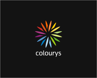
Sunnyfields
by geniuslogo • Uploaded: Sep. 01 '09

Float
(Floaters:
38 )
Description:
WIP-probably done before?
As seen on:
http://geniuslogo.com/
Status:
Unused proposal
Viewed:
3672
Share:


Lets Discuss
nice execution though
ReplyYeah, very nice :)
ReplySweet, this is beautiful
Replygood looking.
ReplyThank you guys!
ReplyVery refreshing, Milosh! Cool that it doesn't form a circle, it has more 'natural' flow this way... Well done!
ReplyI'm also liking the suggested circle shape. To your point, there are lots of suns rising over fields, I wouldn't worry if the idea's similar. The difference is in the design itself. This is looking great!
ReplyNice work. The fields also remind me of corn (maize).
ReplyBeautiful stuff. Really like the colours.
ReplySubscribing the same opinion: very nice! :)
ReplyThanks!
ReplyLooks great, loving the palette**Constructive Criticism: The gap between the sun and the fields seems large. Perhaps try with a gap similar to that between the fields? Just a thought.
ReplyVery cool man, clean great use of colors. I dig the font.
ReplyVery cool! Congrats.
ReplyPlease login/signup to make a comment, registration is easy