BullDog
by Mikeymike • Uploaded: Feb. 18 '10
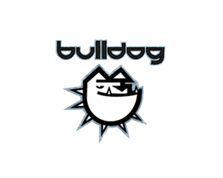
Description:
v2 of a previous logo as seen at http://logopond.com/gallery/detail/94724
tried a custom font.
thought?
Status:
Unused proposal
Viewed:
1685
Share:



Lets Discuss
the dog illustration is very very good... the custom type ain too bad either.. but I would suggest making the whole thing smaller... its got no room to breathe in that space.. %26 then, place the mark above the text in the conventinal way... this current approach does nothing for it...
ReplyThanks, nindo. I'll give that a try. just seemed a tad odd when I first tried it on top because of the spikes.*Thanks.
Replylike were this is goin...agree wid nido on this one...the type carries the aggressive nature of the mark...what about G?...i ges if u use the B and flip it to create G, the structure mite look more balanced..
ReplyI like expression on his face, but connection between typo and illustration is bad IMO. Custom font is also problematic.
Replythanks for the input. i really appreciate it. i'll keep working on the type/graphic combo.
ReplyPlease login/signup to make a comment, registration is easy