A.M.T. ceramics V.8
by kugelis • Uploaded: Dec. 01 '09 - Gallerized: Feb. '16

Float
(Floaters:
33 )
Description:
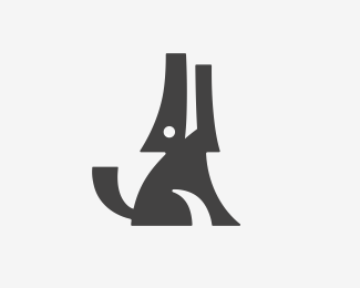
New version. More consistent and balanced. Check out my profile to see the whole design process. Logo for ceramic artist Agnė Miliauskaitė Tulabienė ---- the idea ----> 3 symbols - embryo, animal, fish - clay production. The whole abstract composition defines Agnė's style which is spontaneous & abstract clay art. Also there are 3 different stamps (with each symbol + AMT letters) which can be used to mark the clay products.
As seen on:
Logotipu kurimas
Status:
Client work
Viewed:
15455
Share:


Lets Discuss
i see what you mean, but the older version had a nicer visual tone, the fish was better, i think you shouldn't abstract the forms so much. the more evident eye is better though. nice work it's great to see works like this in the making %3D)
ReplyI appreciate your reasonable opinion. Thanks.
ReplyI see your point. But the idea is not to make all kinds of different shapes with overlaping forms. The idea is to to create an abstract (ink blot like) composition by connecting three forms.%0D*%0D*Here, the forms are more consistent and clear, you can more easily distinguish the symbols.%0D*%0D*The other one, which is in the gallery - it creates some strange, and a little bit complicated and uncontrolled forms while overlaping.%0D*%0D*Anyway its very interesting and useful to hear, that you like those forms. Thanks for your opinion.
ReplyI like the other one better too. It had more of an organic/abstract feeling to it. This one, as David mentioned, seems more controlled.
ReplyLooks just like a Strange design...I like it!
ReplyLovely logo. I love the colors you used.
Replyesto es genialidad pura
Replywow good
ReplyPlease login/signup to make a comment, registration is easy