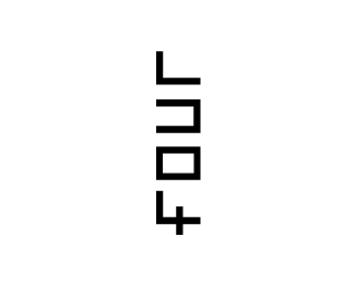
four
by jmutton • Uploaded: Nov. 28 '09

Description:
did this a few years ago while at uni.
Status:
Student work
Viewed:
2652
Share:


Lets Discuss
great! I love logos that you instantly read then wonder how you were able to read it.
ReplyNeat
ReplyHaha, really like this! :D
ReplyI didn't think it was English until I saw a comment, guess I'm not one of the cool people.
ReplyThanks very much for the kind comments!
ReplyFour thumbs up!
ReplyI've just discovered this: http://www.fouragency.co.uk/media/images/bg-welcome.png **do you think the logo used is a little bit too close?
ReplyNo one?
Replyi mean, it's the exact same concept...
ReplyWhat if I were to tell you that the guy who is head of design for that company was actually one of the people that came into my university and mark/assed our work...
Replywhat he grade you?...
Replyis that his company name? have you been in contact with him? that's awful.
ReplyIt appears so. I only discovered this lastnight!
ReplyNo idea what grade I got, this was back in 2006.
ReplyPlease login/signup to make a comment, registration is easy