Netmedic
by Lecart • Uploaded: Nov. 16 '09
Description:
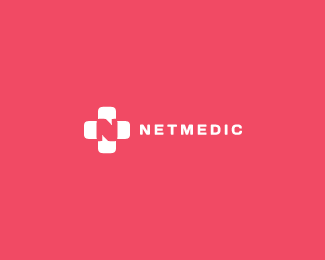
Branding for netmedic.ro
Belongs to a friend, mark includes the N for net and comments symbol relating to a medical community.
As seen on:
my portfolio
Status:
Client work
Viewed:
12553
Share:

Lets Discuss
love the typo and mark. Not so fond of the background color. Doesn't feel medical to me.
Reply%5E thanks, the color interests the client though..
Replythis is very good!
ReplyThank you, also for the floats.
ReplyHey I like this. It's super simple..my kind of style! %3B)**Quick question!*Do you feel like the 'N' is a little fat in the mark? or is that what you were going for? I don't mind it and it doesn't bother me...I'm just curious if you already tried moving the triangle quote things a hair towards the center (move the top one a hair to the left and the bottom a hair to the right). It might help distinguish the %22N%22 more. The stems of the %22N%22 would all be equal in size. However, you might lose the look of the speech marks.**Just curious! Good mark though.*
Reply'sup matthew, it's good you brought that up, cause i did had doubts on it, but eventually started to like it as is. The N is indeed %22groovish%22 :)), after lots of experiments i felt this was the best solution to make the N look like an N and not loose the speech marks. Also, the curves on N give it some depth, i believe. Thanks for the comment! :)
Reply%5EThanks for letting me share my comments. Coming back to look your logo today..I have to agree with you..it has way more interest than just having a normal looking N.**Good job!
ReplyNice, very strong design.
Replywonderful mark:)
ReplyVery nice, strong mark!
Replythis one is very good :)
ReplyPlease login/signup to make a comment, registration is easy