Charters2
by Logomotive • Uploaded: Sep. 14 '09 - Gallerized: Feb. '10
Description:
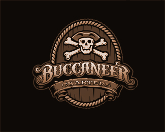
An additional design done for Buccaneer Charters. Monochrome version. Custom typography.
Status:
Nothing set
Viewed:
16673
Share:



Lets Discuss
beautiful!!!
ReplyThat's a fine looking logo.
ReplyWow. I don't know if that's a cask, but it makes me want a high-seas dictionary. Beautiful lettering and illustrations.
Replyi was sure it was you, the moment i saw it. great concept and attention to the details.
ReplyYou make me sick!
ReplyNice on matey.
ReplyThanks guys, truth is this client changed name in middle of work to Passion De Mer(another logo) so this project was abandoned. However,... throw a Tap below the bottom banner and I have Buccaneer Beer %3B) domain is taken I just found out. Hmm..
ReplyThanks me mate Glen, musta posted the same time.
ReplyPeerless.
Replythanks Roy had to google it though, I was thinking like Pier less like no pier :) or plank to walk on.**Thanks absoludicrous, I appreciate that.
ReplyBeen at the rum again?
Replyrummy rummy in my tummy tummy :)
ReplyHard work here mike! Great job as always!
ReplyI'll cheers my green tea to this one, nice mike
ReplyWoohh Mike! Nice job here, looks like you spent the right time on it.
ReplyThanks Steve, hard but fun.*@Raja sure you would'nt like some Mike's Hard Lemonade?%22 :)*Rudy, wow that hits home %22the right time on it.%22... That makes me think real hard so when is it the right amount of time? strong point.
ReplyHey Mike, %22the right amount of time%22 to me is when the design feels finished, feels like it's done, so, in this case IMO if you did something else on top of what you have would be an overkill, nice job buddy!
ReplyRudy ,Yeah that's what I figured you meant. Thanks.
ReplyI tried to think of something interesting to say about this but it really left me speechless...*
Replythumbs up mate.
ReplyThanks guys, hopefully I will find a use for it.
ReplyWow.
ReplyThanks ethereal
ReplyThanks Derek.*Thanks Anthony, first I will need to get my site done and maybe I will.
ReplyHa Ha radhacelis, yeah I guess making babies :) thanks.*Thanks Dalius, Crazy Me.
ReplyPerfect work.
ReplyThanks SRD and Nima.
Replytotally agree with Dalius.
Reply%5E%5EYeah man...this is sweet!
Replynice job!
ReplyWay to go Houston!
Replyyou've got mad skills Mike!
ReplyGlad you guys like illustrative logos too.*yeah thanks Houston %3B)
ReplyAnd great this is. In fact it blows the other one you have on the front page out of the water IMO.
Reply%5E%5E%5E%5EI agree many great designs as of late. Like apples and oranges all sweet, just different tastes.
ReplyYes, there have been many. As to this design here and the number of floats it had previous the gallery inclusion, I think there is a slight bent towards somewhat simplistic designs here at LogoPond as opposed to very detailed work such as this. And that's not knocking simplistic design solutions, look at my stuff. I just see designs like this don't get quite as much attention and I'm not sure why. Mike has great diversity and can execute both simplistic and detailed solutions, which is an awesome thing to possess as a designer. I don't think I could do what Mike has done here and if I could come close it would take me a loooooooong time to do so. Cheers, Mike.
Reply%5E Well I for one have yet to see ANY illustrative logos be at the top of charts. Illustrative logos have a purpose too and send the same message with a little more emotion. It's more than obvious the %22Oh how clever%22 factor rules here. On the same token, I've seen some very plain designs (more branding focus ) done very well, with remarkable branding behind it get poor results.. I guess it's all how one perceives it.
Reply%5E Yep, agree with both of you. Both have good points. It's all personal perception in the end. Thanks for chiming in, both of you, you guys are great.
Replygreat design is great design. and this is great design. real nice work, again, mike.
ReplyAwesome work...really! Such a shame they changed the name! Would love to know more about your process. Love the lettering!
ReplyThis one is definitively one of my favs since I arrived to logopond
ReplyThanks Sean and Mikey:)*@ridekrisride, Thanks I plan o this being one of my first blogs.*@ oronoz%AE wow, thanks I am honored. Would love to work with you one day. *
ReplyGreat !!
ReplyThanks ahmetbarin, was a fun one to work on.
ReplyMe very likes!
ReplyThanks Alena.
ReplyPlease login/signup to make a comment, registration is easy