Havan Electrical
by downwithdesign • Uploaded: Oct. 17 '08
Description:
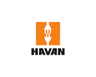
Industrial Electrical Company.
As seen on:
Down With Design
Status:
Nothing set
Viewed:
4167
Share:




Lets Discuss
gareth, cool based on your info here I'd say you nailed it. H/E new and Y/E old. The style of the plug is very old perhaps square (roundish square as in newer style plugs) just the top one up and I think it would really strengthen the overall concept up. Would make more sense IMO.I like.
ReplyCheers dude.%0D*%0D*Your totally right, but in this is for industrial electricians that go around setting up the site electrics so that the different trade workers have a power supply for their tools. I work in construction as well as freelance graphics so I am lucky enough to know that industrial plugs are different to domestic plugs. They are 110volts which is safer and also look like this:%0D*%0D*http://www.ibsstore.com/ProdImages/IP44%2520PM32-791.jpg%0D*%0D*They are also coloured yellow so that they can be seen clearly on site, so for the logo it was an obvious colour choice :)%0D*%0D*I should've included that in my description but I've worked near on 80 hours between both jobs this week so I am way too tired!
ReplyP.s. the above information is correct in the UK only to my knowledge, may be different for you guys over the (logo) pond, I've yet to work on a site in the states :)
ReplyYeah, that must be it. I'm also a licensed contractor in California USA (11years in construction) and my first impression was an older style plug, so my bad You did well then Kudos.
ReplyGareth, yeah different flies on this side LOL!
ReplySeriously? What trade you in?
ReplyNot Now I'm a logoist... Been a conductor for the railroad,EMT, and a D28(Garage Doors,Gates,Openers) contractor..Found my true love now I'm a starving artist. Sorry to get sidetracked.
ReplySame here mate, I blame the beers %3B)
Replywell then here's cheers to a really good logo, drinks are on me.
ReplyThanks for the comliment! (and the ten beers %3B)
ReplyNice one Gareth!
ReplyI like squares so this works fine for me. And the Y is a nice inside-meaning
ReplyUpdated with final type solution.
ReplyHow'd I miss this one?! Nice work, Gareth.
ReplyYou know me Kev, keep it on the D/L %3B)
ReplyGood job Gareth
ReplyHey, what's up doc?%0D*%0D*I uploaded this Oct 17 08, that logo was uploaded Dec 09 08%0D*%0D*http://logopond.com/gallery/detail/47306%0D*%0D*Do the math. They're different anyway.%0D*%0D*That's all folks.
ReplyI like the 'stacked' arrangement, Gareth.
Reply%5E%5E Very subtle.
ReplyNice symmetry on the type, H and N could also have a similar balance
ReplyOh Robert, you slay me.
Reply@LogoMonitor%0D*%0D*I know for a fact this was designed way before the one done by Siah, so does he. It's not like we used the same plug? %3B)%0D*%0D*Grow up Doctor Mcguire, nice try.
ReplyLovely!
ReplyPlease login/signup to make a comment, registration is easy