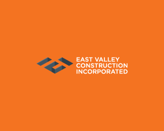
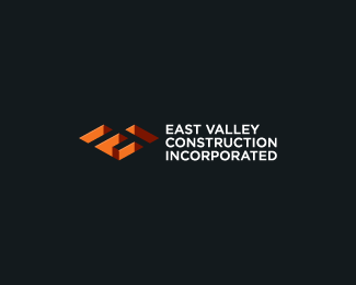
East Valley Construction Inc.
by bartodell • Uploaded: Jul. 06 '08

Float
(Floaters:
13 )
Description:
By far one of the best letter combos I have done, I think. For a modern construction company, startup.
Status:
Nothing set
Viewed:
3026
Share:
Lets Discuss
Nice 3D effect, is the V in there?
ReplyThe entire shape makes up the 'V'. %3B-) Nice one, dude.
Replyvery clever - i agree that the 3D effect should be removed, it's a tad distracting. great type choice to compliment a great visual combo. Is that Gotham or Avenir?
ReplyThe mark has to retain the texture as some call it. The concept is basically a analogy of a buildings footprint or foundation. So it is set to have the appearance of being cut into the background.**Thanks everyone. Doc Oc. Check the logopong forum. It's on.
ReplyAWESOME.
Replywell i love the rendering of the mark - i think it makes it stand out. sure you could do a black mark and it would work well for the instances that need it - but i think the way it currently is draws attention.**great work here mate.
ReplyFantastic.
ReplyPlease login/signup to make a comment, registration is easy