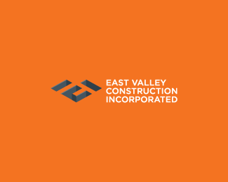
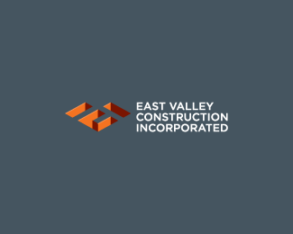
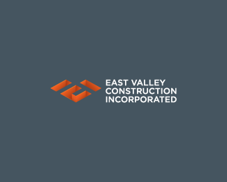
East Valley Construction Inc.
by bartodell • Uploaded: Jul. 08 '08 - Gallerized: Jul. '08

Float
(Floaters:
67 )
Description:
By far one of the best letter combos I have done, I think. For a modern construction company, startup. Third color combo.
Status:
Nothing set
Viewed:
17756
Share:
Lets Discuss
I think thats the best color combo. Nice job on this bart, what did the client think?
Replyawesome mark
Replyyep - the darker background definately brings it out.**awesome!
ReplyLove it... great stuff!
ReplyClever. How does it work on white background?...
Replygreat! ... very
ReplyLovin' the darker background. It looks like you made the 3D effect a little more prominent in this one as well.
ReplyVery, very nice!
Replyvery cool
ReplyThe simplification of the 3D elements makes them stand out much more and are much more legible. This color combo works much better than the first version you posted. I like this one a lot, Bart
ReplyExcellent four way letter combo, bartmeister.
Replygenial -_- respect
Replylove the negative space and colour scheme
Replyyep, 3D logo is very familiar but in ur design it really exciting ! good job !
Replyinspiring %3B)
ReplyGreat logo. One of my favorites on this entire site. What font did you use if you don't mind me asking?
ReplyGreat work! I love the combination of the letters into a beautiful 'building' graphic.
Replya perfect solution . . . i love it
Replynicely done.
Replygood conception!
ReplyMissed this one Bart...real nice.
ReplyPlease login/signup to make a comment, registration is easy