Lords
by JayKay • Uploaded: May. 21 '08 - Gallerized: May. '08
Description:
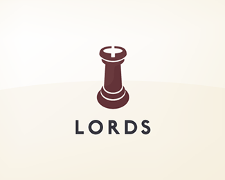
Logo for an upmarket London Estate Agent
As seen on:
-
Status:
Nothing set
Viewed:
5233
Share:

Lets Discuss
Nice mark, might need a crown to give it a more lord feel, and less of a castle piece.
ReplyYou mean make into a King piece instead of a Rook? The idea of using the Rook was to represent their looking after you (the king). Their tagline is %22Property in safe hands%22. The rook relates to the %22castling%22 move in Chess.
ReplyA man's home is his castle. Nice one JK.
ReplyAnd of course represents a house %3B-)**Thanks firebrand!
Replythis is class mate. nice work
Replythat's what i called logotype
Replythis would work great for Lords Cricket Ground too but with three castles. what a dumb comment.. i'll shut up now
ReplyNice. Love the 'R' in that font too... what is it?
ReplyThanks guys.**koodoz%3B the font is P22 London Underground.
ReplyAdded to favourites. :)
ReplyPlease login/signup to make a comment, registration is easy