Sparrow
by kinetic • Uploaded: Mar. 09 '08 - Gallerized: Mar. '08
Description:
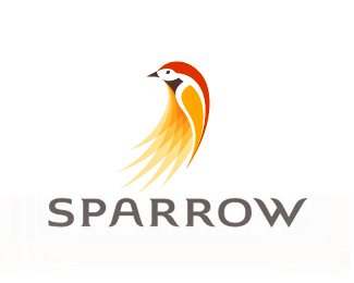
Sparrow not only provides financial and emotional support for critically ill children and their families, but also empowers young people to help a child through charitable service experiences.
Status:
Nothing set
Viewed:
27230
Share:



Lets Discuss
Some suggested that I use one sparrow to make it more elegant. What do you think?
ReplySomeone made the suggestion that one bird is good enough. I agree.
ReplyThanks for the feedback guys.
ReplyIt caught my eye but I feel the overlays and geometric shapes don't quite work with the solidness of the rest,The top half looks great but the rest leaves the bird incomplete, half abstract,half solid?
ReplyThanks Logomotive. I purposely transitioned to an abstract to add movement, interest and uniqueness. It's not unheard of in branding. The New England Patriots logo does this same thing.
Replypersonally i like the blend... have you tried placing the bird at the end of the word sparrow?.. just to see how it would look?
Reply@nido: i'm thinking of the same thing.
ReplyI agree with dsigns and nido, placement of the bird could be better and the end or beginning.
ReplyExcellent logo. Tough, I relay 3 previous comments about layout. Would really like to see the bird on the right (or mirrored on the left). About type, what about creating some swashes/ligatures with ascenders/descenders (mainly R's oblique, W and S)? Just a humble suggestion...
ReplyTruly a beautiful thing. Great work.
Replyamazing art this sparrow is vector i like it *good work
Reply@kinetic, I like the logo, but what is your deal? You're constantly anchoring designs with no supporting comments or reasoning.
ReplyYeah, I would also like to know the answer to onesummers question!
Replybeautiful. i always find myself looking at this logo again and again. nicely executed. :D
Replyi have questions for you. do you know where i can get free tutorial for illustrator online? how do you make the shape so smooth? i tried to make my pen tool design smoother lines but i don't know the function of illustrator too well.
Replyyes the one sparrow is a better solution, this is nicely illustrated.
Replybut sparrows are brown...
Replyto me, the sparrow looks better a bit to the right (2/3 of the way).
Replynicely constructed sparrow
Replybeautiful
ReplyPlease login/signup to make a comment, registration is easy