ALCO
by logoholik • Uploaded: Dec. 12 '16 - Gallerized: Dec. '16
Description:
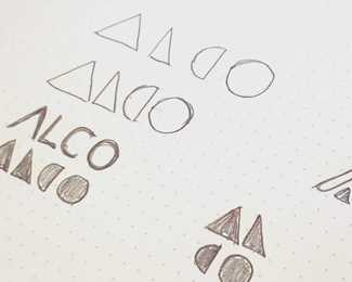
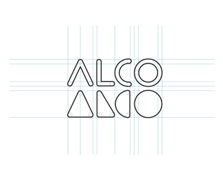
Alco Re-Branding Case Study on Behance:
https://www.behance.net/gallery/46246651/ALCO-re-branding-case-study
As seen on:
Alco Re-Branding Case Study
Status:
Client work
Viewed:
7438
Tags:
rebranding
•
Geometric shapes
Share:




Lets Discuss
Nice!!
ReplyGreat work
ReplyI'm torn on the repetition. I love the case study and I see the symbol only version. Maybe that would read over time. But the type and symbol together... I dunno. It's an unusual lock up. And maybe that's a good thing.
ReplyYeah i see it as a good think i think eventually the type would go, kinda like the nike swoosh, you couldnt really have it as stand alone until it got proper market saturation. but now you dont need to see type to know that check mark is nike, i think it could be the same with this one.
ReplyDavid, you got it right :) Thanks!
ReplyI like this one!
ReplyThanks @BennethCreatives
ReplyThis piece got in 2017 logo trend report! Yay :) https://www.logolounge.com/articles/2017-logo-trends
Replygrats
ReplyPlease login/signup to make a comment, registration is easy