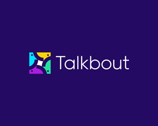
Talkbout
by JeroenvanEerden • Uploaded: Jul. 25 '16 - Gallerized: Jul. '16

Float
(Floaters:
37 )
Description:
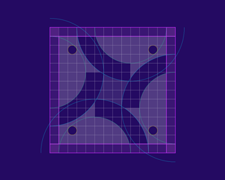
Talkbout - Logo Concept.
Currently open for feedback.
*update: added a bolder type next to the mark.
As seen on:
https://dribbble.com/shots/2857531-Talkbout
Status:
Work in progress
Viewed:
10150
Tags:
human
•
personal
•
opinion
•
board
Share:

Lets Discuss
I don't know if the colors of the icon mean something, but if not I would try to find more expressive ones :) And how about typo in bold? Construction of the icon - outstanding! Regards!
ReplyHey @Logoflow The colors do not specifically mean something here. Currently it's still in the concept phase and was looking for a suiting color choice with a modern feel and nice contrast. Type is chosen felt at the beginning as a good choice since it thin and elegant. But I agree that it may need a little more boldness to compliment the icon a little better. Thank you for your kind words and clear feedback points, appreciated! :)
ReplyI think it's much better, stronger :) And what would you say to put red instead the green guy. I think blue and green color are too similar to each other. Enjoying of your work :)
Reply@Logoflow thank you for the helpful feedback! I'll get into the coloring and see if it needs any changement. Thank you for the kind words! :)
ReplyMy pleasure, my man, my pleasure :)
Replyfun, and well made again! good job Jeroen.
ReplyThank you so much @BuroBlauwBrug (Rien)! :)
Replyawesome!
ReplyPlease login/signup to make a comment, registration is easy