core entertainment
by tpreacha • Uploaded: Feb. 08 '08

Float
(Floaters:
6 )
Description:
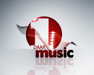
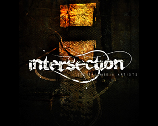
logo design for a music label.
Status:
Nothing set
Viewed:
6213
Share:
Lets Discuss
really like this design. Great Work!
Replycurti, so acho que o %22C%22 poderia desgrudar do %22O%22 para melhorar a leitura, mesma coisa com o %22R%22. Mas ficou bem loko!
ReplyHey Thanks Kieren! **Leoramires i really , really wish i could read your comment, but i dont understand the language. i really hope i could get it in english. all the same thanks for taking the time.
ReplyLeoramires said that the if the letters weren't touching it would improve the read especially the c %26 the r from the o
ReplyOH ok! finally. thanks alot for interpretation. i really appreciate the comment.
Replycertainly the kerning does need a little work. The e overlaps the r much more than the c and r overlap the record. Make them the same and ease up a little and you'll keep the look but make it more readable. I love this by the way. First music label logo I'm going to add to my favorites.
ReplyI wouldn't change a thing. It looks awesome. Great job!
Replydasa
ReplyPlease login/signup to make a comment, registration is easy