FINALE
by Muamer • Uploaded: Jan. 11 '08 - Gallerized: Apr. '08
Description:
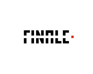
Logotype for the short film: FINALE - by EZ. © Muamer ADILOVIC DESIGN // MA:DE
Status:
Nothing set
Viewed:
9234
Share:
Lets Discuss
I like that very much, how about to keep the mainline of the f connected. because it is hard to read @ the moment. but great concept!!
ReplyI read finale with no problems.
ReplySame here. Read it right away. I wouldn't change it all. Very nice work Muamer.
Replyread FINALE straight away too... brilliant!..
Reply:) Yes, I am happy with this one 2... Thank you all on your nice comments!
Replyit works great!
ReplyThanks Webing :)
ReplyThe red dot makes this one work. Nice job, and thanks for the recent comment. %3B)
Replyi agree with david, great execution
ReplyNice work. Agreed, the red dot brings everything together.
Replyi like it too, its surprisingly legible, i had no problems with it. and the red dot gives it meaning, it looks like it have crossed the word and come to a finale! great job!
Replythis one is truly amazing :) saved to favourites :)
ReplySuch a great logotype. Nice solution, Muamer.
ReplyThank You All for your Interest and Reviews! :D
Replygreat logo
ReplyWow, that's cool!
ReplyBoy I'm slow. Just noticed the clapperboard.
ReplyWow, Brillant
ReplyPlease login/signup to make a comment, registration is easy