Creative Audio#1
by firebrand • Uploaded: Nov. 05 '07 - Gallerized: Nov. '07

Float
(Floaters:
67 )
Description:
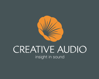
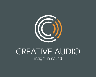
A high-end audio and video electronics business est.1978
Client requested this font and colours.
This one to evoke precision.
Status:
Client work
Viewed:
20243
Share:


Lets Discuss
I like this symbol the most of all four.
ReplyI agree with dache.
ReplyI think the typeface and placing of the typography weakens the strength of the symbol wich in itself is strong enough
Replysolid work.
ReplyThanks all :)
ReplyThis ones nice also Roy. I like how it's so simple yet so 3D. If they don't use it, it would work nice for an architect business starting with a C.
ReplyI like the sound of that, Mike. Cheers bro.
ReplyHa ha always have good puns Roy. hey I like how the C crosses to create the crossbar in the A, sweeet! nice placement.Music to your ears?
ReplyThis one is great! But I like the gramaphone one better.
ReplyThanks Ahab. I'm surprised people like the gramaphone. I thought it was a throw out.
Replyi like all of these, %26 the colors are great too... nice work firebrand..
ReplyCheers, nido.
ReplyThis is great! Very nice concept and execution. All 5*
ReplyThanks, spasquini.
ReplyOld news but...I love this.
Reply@ gthobbs: Thanks mate.
ReplyHi--My name is Nicole.*I am interested in having you design a logo for my project. I can provide you all the details. I would appreciate if you could send me your contact and pricing information. I am contacting only a handful of people and I will be making a decision on price and quality fairly immediately.**Thank you*Nicole [email protected]*
ReplyWe'll atleast she's only contacting a handful of people.. %3B)
Replyoh, i like everything U design. Good job. Congratulation !
ReplyThanks huyen :)
Replyi like it, one of my fav.....
ReplyReally like this. The shadow clearly is not being created by the %22a,%22 but this was designed well enough that your brain tells you it is. Nice work!
ReplyThat's weird, I can't find the offending logo. Hopefully he was banned.
ReplyIt was nearly identical. %3B-)
ReplyWOW))! Great!
ReplySimply wow! On the dot!
ReplyCheers people. Thanks for the comments.
ReplySpotted this today and currently awaiting a response from them. http://corneralliance.com/ourstory.php**As Mike points out, my design has the C crosses to form a crossbar in the A. The only difference with their logo is that the A has a crossbar.
ReplyThat's so lame. Sorry man.
ReplyThis is WORSE than 'BORSE' %3BP
ReplyNo resolution to the issue after all this time?
ReplyPlease login/signup to make a comment, registration is easy