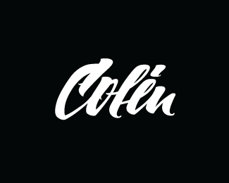
Colin
by fuentoovehuna • Uploaded: Mar. 11 '13

Float
(Floaters:
33 )
Description:
* Var1: the original version, which includes the first four comments.
Status:
Client work
Viewed:
3106
Tags:
black & white
•
type
•
letter
Share:


Lets Discuss
I think it would look a little stronger and simpler if the little notches on the C and O weren't there.
ReplyThank you for your comment, it is perhaps the true.
Replygotta love this one.
ReplyYep, me loving this too. Agree with Sam about the little notches of the 'C' & 'o' with the addition of the 'i' flick-off on the bottom right of the tittle. I think a cleaner approach would suit this better as there's enough character in the strokes and terminals as is. Great job! Love the stoke angles and varying x height of the letters - it fits nicely together.
ReplyThank you very much for your comments!
ReplyNice one! looking great
ReplyOh one more thing, if you don't mind me throwing a little more feedback. I would consider a loop from the 'o' to the 'l' that would connect them so it flows from one to the other. Just a thought.
ReplyDo not mind!
ReplyYes, you will have an option to try a loop. Thank you very much for the comments.
From Colombia, Great Job!!!, thanks for visiting my profile.
Replygreat....love the notches there anyway....giving reason to look at it over and over again...well done!
ReplyJust to clarify, the notches that were mentioned above have been removed, Hanuman.
ReplyPlease login/signup to make a comment, registration is easy