Four Seasons
by Muamer • Uploaded: Mar. 01 '13
Description:
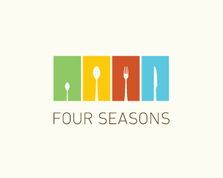
Four Seasons Restaurant logo (WIP) seasons, colors, cycle, trees, cutlery, restaurant, minimal... //////////// NEW UPDATE is here:
http://logopond.com/gallery/detail/192127
© Muamer ADILOVIC DESIGN // MA:DE
As seen on:
http://goo.gl/ULRLW
Status:
Work in progress
Viewed:
10612
Tags:
•
seasons
•
colors
•
trees
Share:






Lets Discuss
haha nice!
ReplyThat's a pretty amazing concept! I wish the colors were a bit more concise.
Replyremind me this one
Replyhttp://events.latimes.com/taste/
@Nash: Thanks.
Reply@Sam: Yes, it's in progress, the fine-tuning is needed on each hue inside this color palette. Thank you!
@bysaule: Thanks for showing, - I have never seen it before. Although the concepts are different they look very similar... Hmm, I will need to figure out some solution here... Any suggestions? :/
Very clever!
ReplyThat's quite a pickle. If you're still using trees to help represent the seasons, perhaps an entirely different approach of zooming in on the four-fork spokes? Just an idea, although this was quite a hit.
ReplyThanks, Dan & Nash! The update is here: http://logopond.com/gallery/detail/192127
ReplyPlease login/signup to make a comment, registration is easy