Pharmabond
by HayesImage • Uploaded: Feb. 02 '13 - Gallerized: Feb. '13


Float
(Floaters:
28 )
Description:
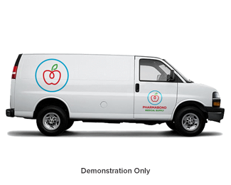
Finished design for Pharmabond.
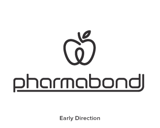
The custom type was dumped (amicably) in favor of a bolder, more versatile typeface.
Brief: Pharmabond are a new medicinal supply company in the US, deal with mostly bulk supply for private practices.
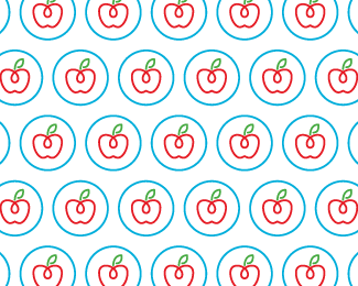
Concept: The apple represents health; it is a continuous line with a loop implying ongoing health. The loop doubles as a droplet, to symbolise medicine, water, purification, etc. The leaf is also a subtle P. The blue enclosure is a protective seal to ensure ongoing health.
As seen on:
Last Version of Custom Type (dribbble)
Status:
Client work
Viewed:
13352
Tags:
Healthcare
•
Product
•
Bulk
•
Chemist
Share:


Lets Discuss
Variations have been added.
Replylooks so good especially in black color version
ReplyThanks bud!! I like the monochrome black too, my favourite is the all blue version :)
ReplyPlease login/signup to make a comment, registration is easy