Mangioni Pizzeria B
by notjelly • Uploaded: Mar. 09 '12 - Gallerized: Nov. '12

Float
(Floaters:
25 )
Description:
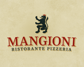
One of the unused proposals for the Italian eatery. The primary element of the Mangioni family heraldry, a rampant lion, is utilized to draw on the restaurant's Italian roots. It is presented in a trendy retro styling in order to appeal to the young urban professional target market.
Designed by Taste of Ink.
Status:
Unused proposal
Viewed:
5357
Tags:
vintage
•
bold
•
pizza
•
italy
Share:


Lets Discuss
YES! this is great, love the detailing on the type
ReplyThanks man! The details in the text is my favorite thing about this version.
Replynice !
ReplyWow, thanks for the gallery add!
Reply@tns no doubt!
Nice work. Would you dare adding a slice of pizza near to the lions hand? It could give it a bit of lightness to the rather serious concept given that the costumer base is young people.
Reply@pav Conceptually, in a heartbeat. But based on the brief the client wasn\'t looking for overly playful.
ReplyIt would stand as a fabulous wordmark, sans the lion. Don\'t get me wrong; the lion is fabulous, but the face and treatment of it is worthy!
Reply@herby Thanks! I gave those letterforms a lot of loving, so glad to see it getting noticed.
ReplyPlease login/signup to make a comment, registration is easy