Linkeeper
by LOGOPED • Uploaded: Aug. 07 '07 - Gallerized: Aug. '07

Float
(Floaters:
56 )
Description:
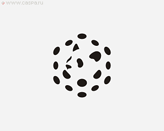
A dandelion in the logotype is a symbol of compound set of indivisible particular units. It is very easy to exchange links - as to blow dandelion seeds away. The mechanical component is accentuated with pure and clear style of logotype
Status:
Nothing set
Viewed:
17481
Share:


Lets Discuss
i love this logo!
ReplyI love how you illustrated the dandelion. Nice looking logo!
ReplyYeah nice NEW take on the dandelion concept. Good one.
ReplyI like the logo, don't like the blue green you used for the BG. You don't actually need it.
ReplyI like the BG color. It's the green leaf like graphic at the left that's bothering me. %3B)
ReplyI have to agree with XLCowBoy. I like the logo. But my question is: is a BG really needfull?
ReplyOclarInk is right, the leaf is distracting. It looks less like its blowing away and more like its coming together. Nice typography as well.
ReplyThis is a great logo. Memorable, and inspirational.**I agree with the comments regarding the background, however. It is unnecessary and distracts from the actual beauty of the logo.**I also am concerned about the size of the font, if it is scale any lower it may not be legible.
ReplyI like this one very much!
Replythe background totally detracts from the logo
Reply%22Linkeper%22 feels out place in contrast to the dandelion mark. %22K%22 readability is a bit challenging. I think if you increase the size of %22Linkeeper%22 and increase the dandelion stem might balance everything.
Reply%22Linkeper%22 feels out place in contrast to the dandelion mark. %22K%22 readability is a bit challenging. I think if you increase the size of %22Linkeeper%22 and increase the dandelion stem weight might balance everything.
ReplyI though this might have had something to do with genetics and chromosomes! still cool though.
ReplyHave to say that this is one of my favorite logos on the Pond and also one of the most underrated as well. It's beauty of simplicity is just timeless and I can't stop looking at it (even at your website). Made in 2007 it set some design trends that were used a lot, even in 2009 and today. All your logos are crazy fine but this one is Top5 definitely! Well done!
ReplyPlease login/signup to make a comment, registration is easy