Stars Equipment_v2
by Mikeymike • Uploaded: Oct. 07 '11
Description:
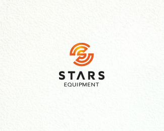
WIP. another version. Is this icon way too over used out there? Or anything like it, that you know of?
here is my other concept. http://logopond.com/gallery/detail/146448
This is for the nuclear industry, does it give that feel?
Status:
Work in progress
Viewed:
3345
Share:



Lets Discuss
Too many like this out there? Thoughts
Replyhave to admit its very familiar, regardles, tis a lovely mark Mike. I'm afraid I dont feel the same about the type, does not seem to fit with the mark. Mark gets a lot of love though.
Replythanks, Paul. mark seems too common and maybe dated. but I think somethings there. Type...yeah just experimenting a bit. thx.
ReplyI wouldn't think the mark was dated, a different type choice and it completely changes its dynamic. Its a good mark. Bold. Lots of potential.
Reply%5E :D thanks, Paul.
ReplyIt does feel a little familiar, Mike, as Paul said, but I like the continuous line and the execution is great. I get more of a radio or wireless signal feel than something related to nuclear though, unless that's the intent. I'm liking the symbol though, neat.
ReplyI voted for version A on dribble ... maybe a bit to stereotype ... this one is %22younger%22 but even needs more to be explained ... aarrghh ... english is so difficult ... hope you understand my thoughts
ReplySean and Bernd, yeah, I know what you mean. Humm, still have to work on this baby. thanks for the critics, I really appreciate them. cheers.
ReplyU P D A T E D ! revised with new type. I believe it helped. thanks for the input.
ReplyPerfect. very professional. I love the mark, my kind of mark. Type is a perfect fit. I feel the character S is hard to work with, nad you've nailed it. Kinda has a radioactive symbol feel of it.
ReplyThanks, Paul. Tried to hard on the type, I think , one the first one.*Thanks for making me rethink it.
ReplyRather nice
ReplyPlease login/signup to make a comment, registration is easy