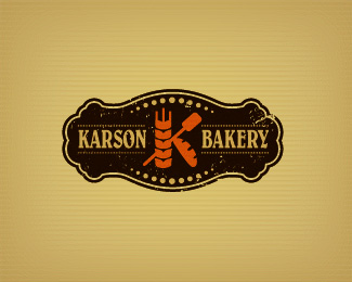
Karson Bakery
by Mikeymike • Uploaded: May. 12 '11
Description:
Unused. changed the name.
Status:
Unused proposal
Viewed:
8308
Share:
Lets Discuss
Totally digging the 'K', Mike. Very clever. Just in my opinion the outer shape, dots %26 texture steal some of the its thunder. In saying that though I could see this working a treat on bread bags and those retro hanging signage boards, so what do I know! %3B-)
ReplyStunning work here.
ReplyHey Simon, yeah could be right, might have just tried too hard to over design. have to take a look see.*thanks for the comment, lecart appreciate the comment.
ReplyNice job*
ReplyThanks for the comment, sergo.
Replylooking for something similar.. please contact
Replyneed logo for upcoming project of mine.. CRUST - Artisan Bakery
Replyjoey3423 if you are interested in contacting me for logo work here is my email, mbruner@odney.com
ReplyIt is in my profile also.
cheers.
Please login/signup to make a comment, registration is easy