Description:
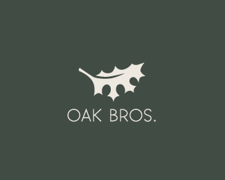
Proposal now used by a new organization. The concept is a living leaf growing from a dead tree.
As seen on:
Behance Status:
Unused proposal Viewed:
28,099
Tags:
•
elegant
•
pretty
•
simple Share:
Thanks so much for the great comments. I can see your point about the text, I am still working on that part. Agencija I updated the description. LadyGrey, thanks, I think? :)
I like the concept. I really do. I love the tree in the leaf and the stained glass effect of the colors... but the font is too chunky and the colors of the leaf remind me more of rot than new growth, especially from a distance.


Lets Discuss
I'm liking it...
Replyverty creative
Reply%5Every* :)
ReplyNice to see new stuff from you Luma, this is very eye catching!
ReplyIndeed, really nice.
ReplyWow, thank you all so much! It is so nice to wake up to lots of great comments!
Replysweet style!
ReplyOh wow, front page :)%0D*Thanks so much everyone! Your comments mean a lot to me.
Replyfresh look and feel, Luma. looking good, bud.
ReplyLooks awesome, Luma.
Reply!
ReplyReally like that, Luma!
ReplyThank you for all your comments!
ReplyNice Tree and leaf! For charity?
Replyspecial!
ReplyHas a nice organic feel!
Replyjust beautiful!
ReplyI'm not a big fan of this type, but the mark... ohh this mark is amazing! :)
Replysuperb. loving this
ReplyI think the type works for me but could be a little smaller and more weight to the color. Again, nice mark!
ReplyHoney tree!
ReplyThanks so much for the great comments. I can see your point about the text, I am still working on that part. Agencija I updated the description. LadyGrey, thanks, I think? :)
Replysimple but perfect!
Replythis is really simple yet very creative.. again, nice work! :D
ReplyHey thanks so much free vector and 1pxrgba! I am excited about this one for sure!
ReplySo sad this was unused! :(
ReplyThanks herbyderby! I did make some changes to this after it was unused, since I did see a lot of potential.
ReplyI like the concept. I really do. I love the tree in the leaf and the stained glass effect of the colors... but the font is too chunky and the colors of the leaf remind me more of rot than new growth, especially from a distance.
ReplyThanks for your comment THEArtisT! I will take it into consideration.
ReplyAbsolutely wonderful use of colors. It looks just like wet tissue paper, which to me is a wonderful effect. Kudos :)
ReplyI really love your interpretation! Thanks for all the kudos!
ReplyI remember this one. Really neat design. I love the coloration.
ReplyThanks nickhood! Your comments mean a lot to me.
ReplyLike the water colour effect. Very natural.
ReplyThanks so much! Too bad this was unused, still looking for a home.
ReplyWhat?
Replygreat one!
ReplyThank you hanuman shakti! You rock!
ReplyFascinating technique for the leaf!
ReplyMaria thanks for checking it out! I really appreciate your comment!
Replyvery nice ! very very well
ReplyThanks so much M.n.M!
ReplyI like the feel of this one.
ReplyAwesome oski! :D
Replythis is awesome, I am interested in purchasing it
ReplyPlease login/signup to make a comment, registration is easy