WIP
by Mikeymike • Uploaded: Mar. 24 '11
Description:
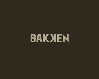
Just checking if this is an easy read?
Status:
Work in progress
Viewed:
2047
Share:






Lets Discuss
Bakken?
ReplyI too read BAKKEN, but I suppose it could be BAKHEN maybe ?
Replyyeah, its Bakken. I know as designer's we look for these kind of reflective letters. Just wondering if it quick enough take to the average viewer. I do like logos that make you have to look twice sometimes though. thoughts?
ReplyI think it's legible enough, the downward stroke of the 2nd K sticks out to me, but wanted to make sure. Oil, chemical or foundry?
Replythanks, Josh. I'll check out the 2nd leg. should be the same.*yeah its oil. this isn't the whole logo, but it has to do with the Bakken Oil basin, one of the largest oil fields found in North America. The rational behind this was that most of the oil is trapped between big shale formations, which makes it so hard to extract. Hence the two %22K%22 locking it in. Thanks again for the feed back.
Reply%22sticks out to me%22 As in I call tell it's a K :) was just clarifying (just in case) as you said %22the average viewer%22 - The lock-in idea seems perfect for the description, I got the 'extraction' concept straight away.
Replythanks, Josh.*how's everything down under? My younger brother lived in Darwin for about 5 years or so. Loved it. always wanted to visit. cheers.
ReplyGood thanks :) People up North are having their troubles but so far (touch wood) we're o.k in the South - If you can cope with 90F one day, 45F the next. Inland NSW %26 Vic would be the ideal spots to visit :)
Replythanks for the info.
ReplyMike, I think that there is a danger of reading Bakoken or Baoen
ReplyI was wondering about that. Even though I would not know how to pronounce that word. I heard yah though. thanks. (:
Replyjust an idea Mike, how would it look if you put that oil drip inside letter A
Replythanks, Florin. yeah, I looked at that and placing two, one on each side of the %22N%22 going up and down. these directions didn't say %22trapped between to layers of shale%22 like this oil formation is all about. Amy have to rethink. But this is why I like LP, it forces me rethink out loud. Thanks for the insight.
ReplyUPDATED: I took out the actual oil drop and just moved the 2 %22K's%22 closer together. Does it read any easier? thoughts.
ReplyDef reads better, but now drop looks like a leaf a bit, do you see it?
Replyyeah, saw that too. Huummm, still working at it. Just feels like I'm close here.
ReplyPlease login/signup to make a comment, registration is easy