ShareAgent
by Logomotive • Uploaded: Aug. 11 '10
Description:
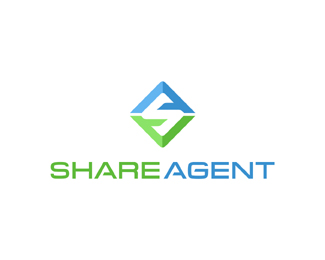
Logo for a Shareholders business.Updated Final Choice!!
Status:
Client work
Viewed:
4719
Share:
Lets Discuss
real strong, mike.
ReplyGreat idea man. Did you try lowering the crossbars on the As just a bit? The weight on the crossbars also seem a little heavy. Your thoughts?
ReplyP.S. I'm referring to the mark. %3B-)
Reply%5EYep good eye doc, I'm working on it as we speak. Sometimes posting here we can see things that we miss BIG :) Thanks bro.
ReplyAnytime Miguel. How you doing these days?
Reply%5E Thanks again. Updated. I'm doing good and busy this month. New girlfriend :) Thanks for your help and asking.
ReplyThanks Mikey :)*
Reply%5Esome lads have all the luck!
Replythis is great thinking man, i would lower the crossbars on the A even more, like you have them on the type, just to get the S consistent%3B and also not my favorite colors for contrast. and the type is looking great!
ReplyHey thanks Lecart, good suggestion. Made that change.
ReplyThis is good Mike, you are inspired lately.
Replywow, nice monogramm. The typography complement the mark very well :)
Replynice solution Mike**I had A and S to work with when I was just getting started and came up with this:**http://rajasandhu.com/images/logos/advantage_solutions_logo.gif**But what you have is a much much better execution
ReplyVery nice mark type, Mike!
ReplyI love your work!!!:)
ReplyShaping up nicely. Glad to see you're staying busy and meeting new people. :-)
ReplyThanks Rudy Yes I am :)*Thanks Alex.*Raja, I guess great minds think a like.*Thanks Vernics*Thanks Moyca*Thanks OC, yep this is the final one :)(Yeah!) I made some subtle changes and feel it is stronger, will now work better in one color and is divided to convey shares better, Yep meeting new people too.
ReplyMissed this one, real nice ME.
ReplyPerhaps make those crossbars lower still? So that the thickness of the horizontal white space would be the same of that of the angled one.
Reply%5EARR let me see. :)
ReplyOK low as I can go :)
ReplyI like it a lot. Some coments for type though: E looks to much condensed to me (compairing to other letters) and G's crossbar could have been verticaly centered and so aligned with the E's one. Part of these peeky details and as usual, that's an impressive work.
ReplyThanks Thomas for your eyeballs and everyone else for your comments and suggestions. The type is basically Eurostyle. Signed off and done deal.
ReplyGood news Mike. Another day, another Dollar.
ReplyThanks Roy, that's always a good feeling.
ReplyAnd another happy client.
ReplyDamn good Mike... Great improvement! You did a great job with this (I hate it :) Eurostile. The mark is really impressive.
Replyvery nice, never liked eurostyle as a font, but it works extremely well here with the customization. Mark and colors are very nice.
Reply%5E%5E%5E Thanks again.
ReplyExcellent solution for the 2 letters. Too clever!
ReplyThanks koodoz, www.shareagent.com coming soon.
ReplyFinal results. www.shareagent.com
ReplyPlease login/signup to make a comment, registration is easy