Curious
by actiondesigner • Uploaded: May. 28 '07 - Gallerized: May. '08
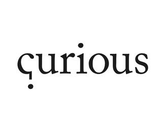
Description:
Originally intended for curious.no
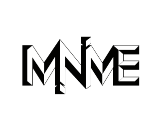
Their work with people in organizations to help them see oportunities in each other. They help bring out creativity and team spirit through activities that the organization finds motivating. They also help the organization with coaching, concept development and visibility. All the activites are based on Curious' values; couriousness, inspiration and credibility. They are called Curious since curiousity is probably the best feeling you can have. It leads to exploration. The logo tries to reflect the main essence of just that, give the logo a clever concept reflecting their creative apporach and the fact that with curiousness you never know what you gonna get and triggers just that curiousness to hopefully help trigger and grab the organizations attention
Featured in Logo Lounge 4.
Status:
Unused proposal
Viewed:
20484
Share:

Lets Discuss
smart idea
Reply**Is this associated with Curious Pictures? Are they changing their name?
ReplyNo ...this was a proposed logo for http://www.curious.no but they allready had extensive branding for them to use this one instead. I have no knowledge of what curiouspictures is. And I see that they have a questionmark instead of a P.
Replybright and simple!
ReplyClever.
ReplyMan, this one is so much better than what they are using. What a shame.
Replyyour logo is better, but the girl on their homepage is HAWT.
ReplyReally nice, simple and very, very effective.
Replyburn, exactly what I thought of as well.
ReplyThanks all for your comments%3B)**@cfig*Did you sink my logo because you THINK or believe I rippet of their logo? Im from Norway. I got my logo in logolounge by being evaluated by Louis Lygo of Wolff Olins, Jerry Kuyper of Jerry Kuyper Partners, Jason Schulte of Office, Gaby de Abreu of Switch Branding %26 Design, Haley Johnson of Haley Johnson Design, Neville Brody of Research Studios, Janet Martin of Communication Arts, Inc., and Chris Campbell of Interbrand. Dont you think they would have noticed this? **By sinking you are calling me a liar and I cant have that.**curious.no is a norwegian company. I solve many of my logos with concepts like this.
Replyno, I don't think it was intentional...just that it's very reminiscent of the work. It's very possible you never saw the other mark. As I have seen a similar idea before, however, this doesn't strike me as particularly original. Am I not allowed to not particularly like something for my own reasons? You might also message me to discuss something like this rather than call me out in public, would be a bit more professional.**I'm very happy you got your work into LogoLouge, congrats. Personally, I find the books to be a bit hit or miss, however, while some work included is rather strong I'm very surprised at some of the work that does get included. Yours is better than most, in any case.
ReplyJust that you first implied ...then sunk it! Dont have any problems with you not liking it. Believe me:) And If you sunk it without any comment I wouldnt mind. Nice to get the reason behind it.**My point with logolounge wasnt %22The logo has to be great. Its in Logolounge%22 Just wanted to point out that the judges combined must have an idea whats out there. Nothing more**Sorry for coming at you like that, cfig. My apologies
ReplyNo prob, the similarity is just surprising (particularly considering the name) but i know stuff like that can happen. sorry if you thought i implied otherwise.**and i actually didn't know you could see who sunk or floated a logo til now :)
ReplyWell said climax, and I'm certainly planning to keep voting :)
ReplyHello. I'm curious to know if the curious logo is available. Please advise. Thank you.
ReplyPlease login/signup to make a comment, registration is easy