Cyclone
by frankp • Uploaded: Feb. 20 '09

Float
(Floaters:
7 )
Description:
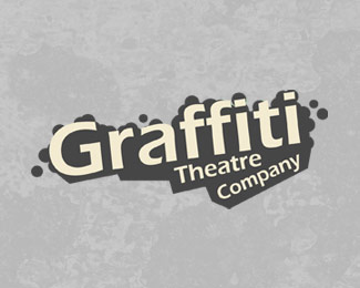
Logo for a theatre repertory company. They wanted something that would refelect how dynamic and exciting the company is, and at the same time being a credible and professional mark.
Status:
Nothing set
Viewed:
2677
Share:


Lets Discuss
as part of some native american pantheons, there are the five wind gods: north, south, east, west and, their bratty little brother, tornado. from dust devil to tornado to hurricane, I can't help but see it as just that, the four winds bratty little brother throwing a tantrum. if you have kids you can see it. the bigger the fit, the more damage there is.**it doesn't look like a cyclone from far away, so I don't think it will translate well to small sizes. give it a little more definition or use it separate and larger from the text. I could see it curled over the C on the left.
ReplyOh Bugger!*A little piece of me just died! ***This is amazing. I think the cyclone needs to be slightly bigger but hey...**Kudos.
ReplyThanks guys, comments appreciated**@THEArtisT - thanks, I know what you're saying. It's tested ok at small sizes, I realise that at very small sizes the cyclone is somewhat lost, but you have to go very small for that to happen.**@renalicious - you are too kind, thank you :) I did play with sizes a lot, originally the cyclone was indeed bigger, but my feeling was that at bigger sizes it felt too much like it was a bit of trickery, whereas at the smaller size it was more at ease with itself or quietly confident. Does that make sense?**Thank you both for your comments and feedback.
ReplyVery nice...
ReplyThanks! :)
ReplyPlease login/signup to make a comment, registration is easy