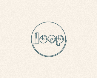
Absinthe
by florisvoorveld • Uploaded: Jul. 21 '11 - Gallerized: Jul. '11

Float
(Floaters:
79 )
Description:
Jugendstil wordmark
As seen on:
florisvoorveld.com
Status:
Work in progress
Viewed:
7258
Share:


Lets Discuss
Once again, this is really great.
ReplyAs an avid absinthe enthusiast (I actually know a tremendous amount about absinthe%3B some might call it an obsession), I feel like stylistically, this mark is on point. However, I'm really confused by the color choice. Even the most abecedarian absinthe drinker would tell you that the color most associated with absinthe is green. La F%E9e Verte, The Green Fairy. There are some things you just don't take artistic liberty with, and I feel like the color of an absinthe logo is one of them. And yes, I know, the best absinthes being produced are actually clandetine La Bleus, which are actually clear (they don't run their distillate through a coloring phase with green herbs), but most, if not all people naturally associate absinthe with the color green.
ReplyAt any rate, I floated this because I think the lockup as a whole is MF-ing phenomenal.
ReplyFloris, this is just great, balanced, interesting and fantastic.
ReplyThank you all!**@Jon: Cool to hear man. I know green is the colour that is associated with absinthe. But this is for something totally different, not for actual absinthe. I chose the name because people also link it with hallucinating, as a metaphor (Van Gogh is rumoured to have had some when cuttting of his ear), so I wanted the colour to stick to that theme too. From that point of view green just seems too obvious.
Replycolour not final though, might throw in some green %3B)
Reply%5E Green blue combo would be more absinthe-ish %3B)
Replywow..........just.....wow...
ReplyFresh, great style, love the gradient too.
ReplyLovely line work! love the a b ligature.
ReplyThanks for the kind words
ReplyI really like what you've done here, Floris. These thin intricate strokes with this gradient are killer.
ReplyThanks Nicholas
ReplyReally love this a lot, great job on this all around, Floris!
ReplyBuenisimo!
ReplyThanks Sean, Gracias Chris.
ReplyLovely style, well done
ReplyYummie - love it.
ReplyBeauty, Floris.
ReplyStunning work.
Replylurvley!
ReplyThanks so much guys!
Replyreally like this one. such clean line work.
ReplyI think the color is accurate. I instantly related with the flashy hallucinogenic look, though green is it's main, this is really suitable!
Replygreat %22!
ReplyThanks lads! I'm now emotionally preparing for this one to leave the front page... :D
ReplyOoo...this is really stunning!
ReplyExcellent! That gradient.. uff..
Replyagree excellent work ... really good
ReplyI love line work! Wish I could do it as well as you did here. Bravo!
ReplyThank you Milena :)
ReplyPlease login/signup to make a comment, registration is easy