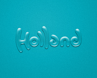
Well, I think as a European (or anywhere outside Switzerland for that matter) you might have doubts, but when you'd see this in the middle of Switzerland I don't think anybody is going to think it's the flag of denmark
Yeah Floris, really good to read. I read Swiss instantly. But i agree with the denmark flag issue. The proportion isnt swiss... anyway, great work! Congrats!
I don't know if I will read it as swiss without the title, because (ok I must admit) my fault that I've looked at the title first. Erase my memory to that moment and give me one more chance! Anyway, I think this is a nice piece of work, and it's legible enough.
Read it as 'SWISS' immediately, even before reading the title. Great branding potential%3B involves the reader, pulls them in. Nice work, m1sternoname.


Lets Discuss
Might work better for Denmark due to the cross proportions %3B%5E)
ReplyIt's neat, but not sure I would have read it without the description...
ReplyI'm thinking of using the S for a mark. The showcases version is very conceptual but very nice for branding imo (think bc, letterhead, envelope etc)
ReplyUnfortunately, I think David has a point here, especially if you decide to go with the one S only as a mark...
ReplyWell, I think as a European (or anywhere outside Switzerland for that matter) you might have doubts, but when you'd see this in the middle of Switzerland I don't think anybody is going to think it's the flag of denmark
ReplyI read it right away... great idea.
Replylooks more like Denmark to me.
Replyworth1000.com? Good luck, I like this style.
ReplyYeah Floris, really good to read. I read Swiss instantly. But i agree with the denmark flag issue. The proportion isnt swiss... anyway, great work! Congrats!
ReplySpot on. I read it instantly at thumbnail size - fool proof.
ReplyI don't know if I will read it as swiss without the title, because (ok I must admit) my fault that I've looked at the title first. Erase my memory to that moment and give me one more chance! Anyway, I think this is a nice piece of work, and it's legible enough.
Replyyou are a master of swiss design
Replys would look well as a mark.
ReplyYeah, it is very difficult to read. When I read the title I instantly found that in the shape. Otherwise, it took me time to read...
Replyi read it no problem
ReplyIt took me a milli second to read it.. Thats it! I think its quite legible.
Replythank you all for the kind words :)
Replywow...this is clever man.
ReplyLove it.. But I see Denmark.
Replylike
Replyi read it at first fight! but i have to admit this is for designers eyes
Replycool work. congrats!
ReplyLove this logo, smart! elegant!
Replywow, very interesting idea!
ReplyI read it too at thumbnail size. Clever design.
ReplyI read it instantly, I would hate to see it change. Brilliant.
Replygreat one, I read it....good legibility and readability
ReplyYep, got it straight away. It's everything I love about logo design. Excellent job.
ReplyRead it as 'SWISS' immediately, even before reading the title. Great branding potential%3B involves the reader, pulls them in. Nice work, m1sternoname.
ReplyYeah a masterpiece..!
ReplyI like %3B)
ReplyDenmark! Lovely constructed.
ReplyCOOL ONE
ReplyThanks Mark
ReplyI keep coming back to this one%3B it's beautiful. So clean and elegant, very memorable.
ReplyAmazing! Absolutely amazing. Perfect symmetry and execution.
ReplyPlease login/signup to make a comment, registration is easy