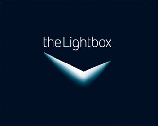
TheLightbox
by firebrand • Uploaded: Feb. 06 '08 - Gallerized: Feb. '08

Float
(Floaters:
71 )
Description:
Photography and art gallery.
Status:
Client work
Viewed:
20034
Share:


Lets Discuss
Nice one Roy! Strangely beautiful...
ReplyThis is clever and well executed. I like how you placed the type on top of the mark. Not that it matters... but would you ever reverse this out (black) and how?**I love it.
ReplyThanks again for your comments Andrew and Ahab. This baby aint gonna reverse out since the light would be black. And looks weaker in 'line' which I guess are reasons for its rejection.
Replyoooooh niiicce
ReplyREJECTION!? Crazy bastards... this is a done deal to me. AHHHHH! *At least you have a cool portfolio piece out of this.
ReplyThanks raja and ahab :)
Replyhooohaaa!... spectaculaaaa!
ReplyWOW Amaaazing!!!!:D
ReplyLove the fact that it represents the 'L' as well. Stare at it long enough, close your eyes and its burnt in your retina forever! Way2go Roy!
Replynido, oronoz and chan the man... thanks for dropping by. Keep up the good work! :D
ReplyWhat an eye catcher... Id love to see this fabricated as a sign, Oh the possibilities!
ReplyShiny :) It is a shame they didn't use it...
ReplyI LOVE THIS THING! **I keep running into it on the gallery and it hits me right in the face every time. I want to start a company just so I can use it.
ReplyLol! Thanks fellas.
ReplyFirebrand, how would this logo work on white background?...
Reply@Nomadesign: Thanks, I hear what you're saying...laser light rather than diffused light. I might give that a go.**@Respiro: Good point. It would have to be contained within a box as it won't reverse out.
ReplyIt looks very nice indeed. But I wonder if such a logo would be easily %22portable%22, if it can fit anywhere. For example, on a white sheet of paper, would you make it fit in a blue square ? That's the only problem I see with this kind of logo.
Reply@bbx: Granted, not as easy as some. Thanks.
ReplyBeautiful! Love the light...
ReplyWow, my eyes are hurting, but only because it's so cool. very EYE catchy ROY. The V shape reminds me of some auto company but I can't think which one. Very interesting logo.
ReplyThx Thomas :)
ReplyCheers, Mike. Would that be the 50's Cadillac logo?
ReplyClimax: That's logical criticism%3B) I'd lose the L shape if I added another side but I might try bending it a little. Thanks.
Replytook me 10 minutes to figure out that was a crack. and it was worth it. beautiful crack you got there :))
ReplyWoah steady on! Thanks degro %3B)
ReplyVery cool. This is instantly memorable and dramatic. Great work.
ReplyCaught my eye right away, but before I read the comments I kept seeng 10 minutes to 2... I guess the diffused light made it look like a backlit clock for me
Reply@djuice: I was waiting for that comment %3B)
ReplyIt's a really cool concept, now that I see it. I'd try to make it look more like a lid before it gets stuck at 1:51 for some people %3B%5E)
Replybeautiful! but obviously the client would not pick that..... unless if the client was some teenager. I also want to you that it is somewhat similar to the xbox idea, but actually better.
ReplyThanks Leo and djuice.
Replylove the font...what is it?
Reply@vko: a modified DIN
ReplyI feel that more could have been done with the name LightBox. Just a little disappointing :( Sorry!
ReplyThey chose a word mark, so just as well I didn't do more with the name 'LightBox'.
ReplyBeautiful!!! One of the strongest logos I've seen on this site. Top job!
ReplyThanks redfour :)
ReplyIt reminds me of the Rexona's mark (reversed, though!) :D*Nice work. :)
Replywow, it's amazing how the shape looks so much to this one%0D*%0D*http://www.qbmedia.com/logos/logos/preparados/blackburne.jpg%0D*%0D*and how this logo you did%0D*%0D*http://logopond.com/gallery/detail/15494%0D*%0D*looks so similar to this one!%0D*%0D*http://www.qbmedia.com/logos/logos/preparados/Dinnerlogo.jpg%0D*%0D*It seems as you like qbmedia logos too much!
Reply@accusador: No, I don't think so but thanks for the links.
ReplyYou are welcome
ReplyThat's pretty intense
ReplyThanks, Zoltan :)
ReplyWOW!
Replywhat about rexona mark
ReplyGet a life, senagh!
ReplySorry, I meant to say senangh.*Anyway, the Rexona or Sure logo is actually closer to the Nike tick.*This Lightbox logo has a completely different concept and execution.*
ReplySorry, try again sonny. No likeness whatsoever.
ReplyThanks again, Sean :)
ReplyGood concept, altough i think the upper part of the box should be logically darker. %3B)
ReplyThanks RansTasipi, I had a play with the blend tool: *http://logopond.com/gallery/detail/62324
ReplyPlease login/signup to make a comment, registration is easy