Float
(Floaters:
30 )
Description:
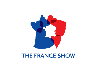
Concept for a UK exhibition celebrating all things France.
Status:
Unused proposal
Viewed:
9330
Share:


Lets Discuss
Very Nice. The inside and the outside are the map of France. Very innovative
ReplySorry didn't get that it was france. Doesn't look very french either. Although pink might be a nice additon to the contry colors. Not to sure I would call this a logo.
Reply@ climax... lol... protect or destroy???.... hhhmmmm
Reply@sclark05 - Sorry about that %3B)
ReplyThanks for the positive comments guys.
ReplyBeautiful non-traditional logo image!
ReplyImpressive image! I'm french and I got it at first sight! Luckily it is not designed for french people because I think it's too subtle for many of them. Just thoughts about your work which looks tremendous.
ReplySorry, I didn't get that it was France in the neg/pos space, maybe I don't know my geography that well. Also the pink threw me off, I agree, darker red would probably work better. But I love the style and graphical mark, it's beautiful.
ReplyExcellent idea. Nice job!!
ReplyThanks everyone for the feedback. @Nomadesign and geminirene - the dark red is an interesting suggestion for the overlays.
ReplyGreat mark must say, love the concept didnt totally get the french connection apart from the map, since im still in the dark ages and think of red, blue and white but lovely none the less
ReplyThanks for the feedback kaimere. That's exactly why I think this is a great place to test the water. The client went for a more immediate solution in the end which I might put up when it goes live.
Replyvisual noise
ReplySmart, but not overly effective, and probably downright hard to brand. Though as been pointed out, substituting colours may fix it.
Replyi don't wanna break this fun party here but do you think this my be a rip???*Check the site and scroll down until you see Convention Bureau of Poland logo that was designd in 2006...**http://www.eulda.com/2006
ReplyI'll party on I think. Thanks for the link. :)
Replythere is definitely a raw appeal to this logo, so you have captured something...l'amour!
ReplyWOW - did I just spell definitely correct? that's a first
Replythere's spell check on this!... **(*sigh)
ReplyLol! Thanks, Raja.
ReplyWhile I was changing over to png I thought I'd update the colours on this one.
Replyhey, I'll be linking this logo back to your site roysmithdesign on 28th Jun, hope that's fine with you.
ReplyYeah sure, feel free.
ReplyWoah%7Ei like it so much/
ReplyThanks snowkai.
Replywow that is smart, and very much French :)
Replytr%E9s tr%E9s bon travail
ReplyExcelente idea!
ReplyThanks all!
ReplyPlease login/signup to make a comment, registration is easy