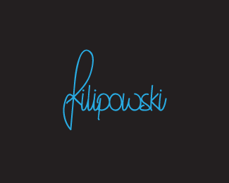
Float
(Floaters:
13 )
Description:
Personal mark.
It's my handwriting.
Status:
Client work
Viewed:
1484
Share:


Lets Discuss
Fajny handwriting masz w takim razie :)
Replydzieki %3B)
Replynice
Replythanks icu :)
ReplyVery nice! Not sure on the color though...
ReplyVery cool handwriting! Like the 'ws' the best.
Replythanks guys!*Julian. Yes, maybe I could change the color. It all depends on my web :)
ReplyI would think that your web(site) would follow your branding/brand colors...Correct me if you meant something else with %22web%22.
ReplyYes, You have right, I thought about the website, first concept was black letters and white background, but I chose this and I'm keeping it, but my web isn't ready yet and I told: %22It all depends on my web%22, my fault %3B)
ReplyYour name is soo close to mine :D
Replygreat Felipe, because the F is power :D
ReplyFajny, moze by jeszcze pokominowac z rozna gruboscia linii :)
ReplyBeautiful, the font is excellent.
Reply@mamgust.com: w wolnej chwili będę kombinował :)*@Pierro: thanks!
ReplyPlease login/signup to make a comment, registration is easy