BE BERLIN
by fanego • Uploaded: Dec. 12 '10

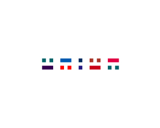
Float
(Floaters:
3 )
Description:
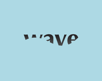
Logo for a project named 'BE BERLIN'.
Status:
Student work
Viewed:
2303
Share:


Lets Discuss
www.ulikeit.cz - I know, idea is different but I can see too much similarities...
Reply%5E The only similarity I see is the colorscheme. Totally different concept.
ReplyFrom I AMsterdam to BErlin ha? :) Nice if haven't been done before. :)
ReplyI also think that underlining it only once by color would be enough if there is another different reason for the line. Isn't a problem for a real life branding project the similarity in idea with the %22I Amsterdam%22?
Replylike BECOME.
ReplyNicely done Fanego, interesting type.
ReplyPlease login/signup to make a comment, registration is easy