Description:
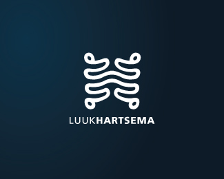
Logo for a carpentry and construction company. Logo features the companies initials. Inspired by housing framework
As seen on:
InspiredConstruction.net
Status:
Client work
Viewed:
5990
Share:


Lets Discuss
Finally something new from you buddy! :) I like this one a lot - clean, simple and to the point.
ReplyI know man, been a while! Thanks a lot, Alen. I'm happy with it.
Replythis looks great!
Replyneat and nice
ReplyCheers fellas!
ReplyYup, nice work!
Replycheers man!
ReplyHey, man! Nice work.
Replynice job..
Replycheers guys!
ReplySimple and realy good!
ReplyThanks mate!
Replysymbol is a little bit difficult but nice anyway:) maybe type needs correction tu get in harmony with symbol
ReplyHmm, good points.
Replyhmmm interesting one
ReplyPlease login/signup to make a comment, registration is easy