Description:
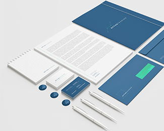
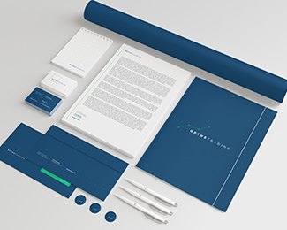
The Optus Trading is a foreign trade company - import and export - focused on optimizing costs and processes for small and medium businesses. The company opened its doors in early 2014 and promises to shorten the distance between your client and the world, offering a wide range of services already common among companies in the sector, but with clear differences in the dynamic and proactive care, in the creativity in the search the best solution and the constant monitoring of processes.
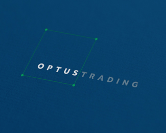
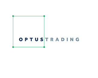
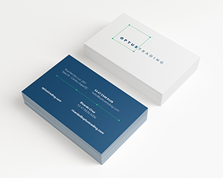
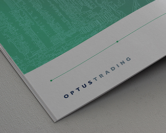
Based on this focus and brand promise, we look for a dynamic solution for visual identity. We use the concept which says that "a straight line is the shortest path between two points " and develop a cambiante symbol, which can take many forms from the link between the points, adapting even the materials that are used. The logo was developed from the family Effra Bold, with the necessary modifications to make it unique to the brand.
Together with the client , we were very pleased with the result and we hope you like it too!
As seen on:
Optus Trading
Status:
Client work
Viewed:
1277
Tags:
Trading
•
Optus
Share:
Lets Discuss
Please login/signup to make a comment, registration is easy