Description:
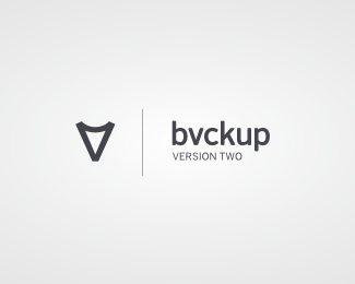
Rework and tune-up of the logo for the next, much improved version of Bvckup - the minimalistic real-time backup software.
The original logo version is here.
As seen on:
http://www.bvckup2.com
Status:
Client work
Viewed:
10484
Share:



Lets Discuss
Pushed the teaser site out this morning, and it comes with an updated logo.
ReplyGood luck, man. I really like the mark.
ReplyHeh, thanks, Stelian. It might be a bit of an uphill battle to build _Windows_ software that values design and polish over a laundry list of loosely connected features. But we'll see...
Replyvery interesting and clean.
ReplyGood luck AP, lookin' good man.
Replysuper strong this one !!
ReplyI prefer the original. Here, the mark and type seem too disconnected IMO.
Replyfeels like I've seen it before
ReplyThat's for the spotlight, David.
ReplyDamn iPad -> "Thanks", not "That's"
ReplyPlease login/signup to make a comment, registration is easy