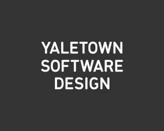
YTSD identity
by epsilon • Uploaded: Dec. 22 '10

Float
(Floaters:
2 )
Description:
Yet another pass on the same idea. The question is if it works as an identity (as opposed to just being instantly legible).
Status:
Work in progress
Viewed:
2562
Share:


Lets Discuss
Thoughts?
ReplyFor what?
ReplyI would say no, not as an identity, it doesn't really identify anything at all... maybe Yale town (but I have heard of Yale town so that was easy).. but then the rest makes little sense, but I guess that would be then going into the legibility issue, which we are trying to avoid in the discussion... so, it, imo, has no individuality that allows for it to be identified.
ReplyI prefer the type and approach on this one**http://logopond.com/gallery/detail/59676**perhaps even placing it in an enclosure would give it enough distinctiveness?
ReplyThanks for the comments, Nav. **Regarding this _identifying_ something - consider for a moment that this is written in the language that you do not understand. It would still form a certain impression based purely on the choice of the typeface and the overall composition. This impression is going to remain with the viewer when he takes his eyes of the logo. This brand afterimage is as important part of the logo as its visual appearance. It defines the brand when the logo is not around, and the more lasting the impression is, the stronger the identity.**Go back to the logo being in English, and its shape and composition are now complimented by a thought process that is invoked by the visuals. The more unusual this process is, the more chances the logo would stick in viewer's memory. Throw something unusual at them and it will make them pause and notice. Or wonder, puzzle, cringe, whatever, but in the end they will have a strong emotion that will form the logo afterimage. This is why the neg space logos are so good, and this is what the AHA moment in the logos is about. These help logos stick.**See where I am getting with this? This particular logo tries to achieve the same effect with a WTF element that requires pausing and thinking. Do tell me that you will _not_ remember this logo when you see it for the second time, and I will take it all back :)**
ReplyI'm afraid if you take it ALL back you may hurt yourself... kiddin %3B)... I couldn't help but get the feeling (and I am in no way attempting to be fasitious here) you may be (way) over thinking this... **if these guys took out an ad in the local paper... let's just say for arguments sake, a small ad, what is it about this logo that would have it stand out from the rest of the text on the page? that there are no spaces between the word? that is what you are pinning all your hopes on? I do not want to get stuck on semantics however... I'm just saying that this, imo, and taking into consideration your (lengthy) effort to explain it, does not do a great job at %22identifying%22 itself... **As for the question %22would I remember it the second time%22... well... I am yet to be convinced I would even notice it the first time :)
ReplyYaletowns of T ware design.
ReplyThis kind of reminds me of that Cambridge University study %22can your read this.?%22 yet NO I can't read it the right way. I read it like I posted.
ReplyMrerry Crhistams, Episoln
Reply%3E you may be (way) over thinking this... **Yeah, I have this tendency for sure. Better than the opposite though :)**%3E if these guys took out an ad in the local paper... **We both know that the best logo for a newspaper ad is the one with the boobs in it. That's if the intention is to capture an attention of an uninitiated random reader. But that's not what the identity is for.**%3E I am yet to be convinced I would even notice it the first time :) **Too late. What has been seen, cannot be unseen :)
Reply@mike - yes, %22yale towns of tware design%22, %22yaletowns of twared e-sign%22, %22yale to own softwa redesign%22, etc... none of which make as much sense as the original does, which is the point.**And, both of you guys, try this as an experiment. Try and rationalize why your own best logos are actually the best. Not that they have great execution, or they have an interesting concept, or a clever neg space, but _why_ each of these _actually_ matters. I'm sure you routinely reject some concepts as %22weak%22, but what is %22weak%22? Rationalizing is hard, but it can be quite enlightening. You would in all likelihood arrive at something similar to what I wrote above - that it's the _impression_ of the logo is what defines it, be it legible or not.*
Reply%22Yeah, I have this tendency for sure. Better than the opposite though :)%22**It's great to really think things through... but be very careful what you convince yourself of.**%22Too late. What has been seen, cannot be unseen :)%22**Logopond does not count... otherwise your initial comment %22Do tell me that you will _not_ remember this logo when you see it for the second time, and I will take it all back%22 becomes a little redundant too... I noticed this here because you were the first to comment asking for our thoughts... %26 I would remember it because I took the time to comment on it... now back to the real world.. I'm still not convinced I would even see it the first time.**
ReplyPlease login/signup to make a comment, registration is easy